Bread Favourite
Garlic Naan
A classic tandoor bread that anchors the whole menu and pairs with almost every curry.
$4.00
Crafted around the saffron-and-spice character of the logo, this new look feels timeless, elegant, and inviting. It pairs bold Indian flavors with a heritage-style presentation built for modern online ordering.
Authentic
Indian comfort
Fresh Daily
Curries & breads
Easy
Pickup & delivery
House Signature
Spice-led plates that still feel comforting.
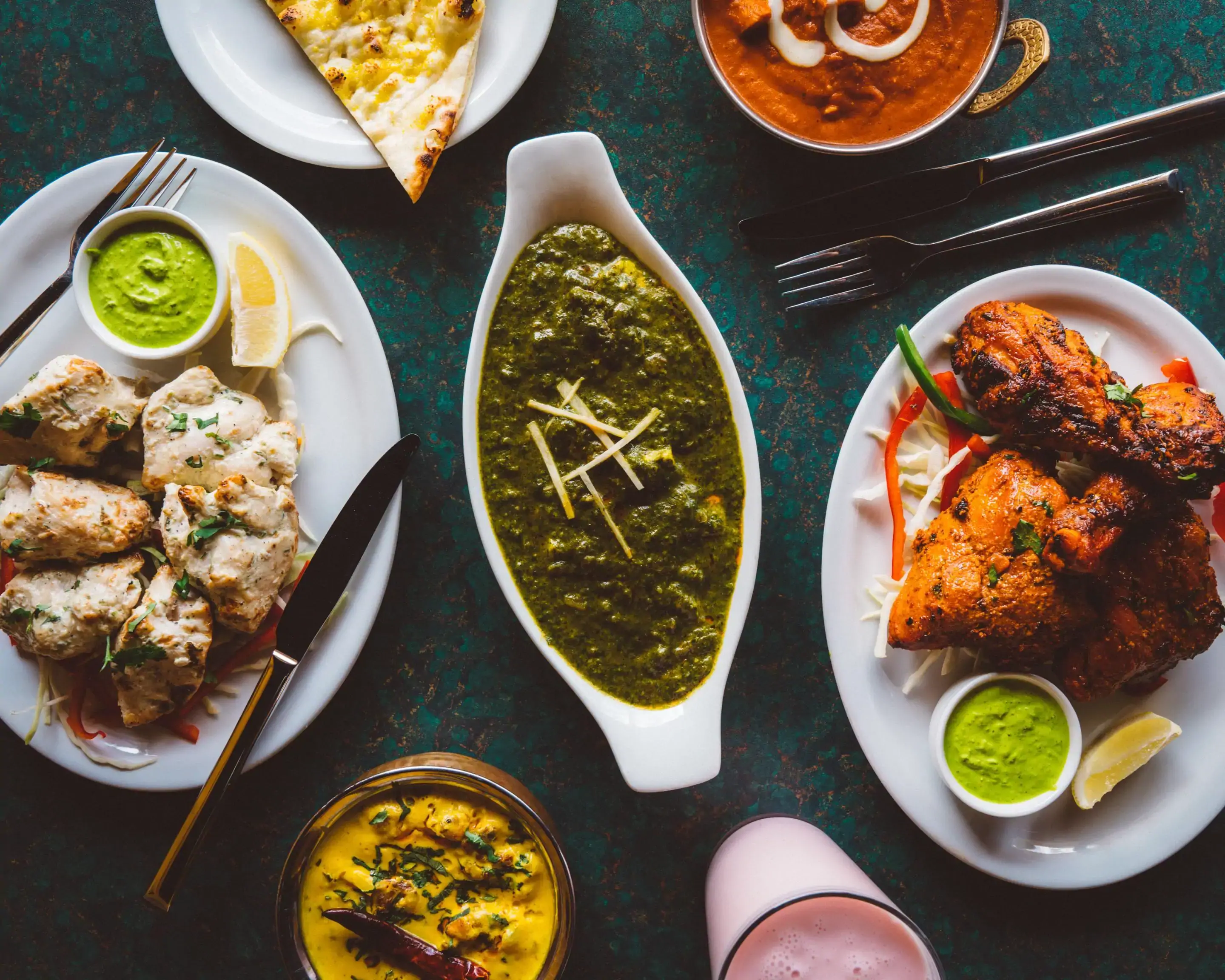
From golden naan to velvety spinach curries and tandoor favorites, the experience is designed to feel abundant and memorable.
Easy Browsing
The menu is organized into clear categories so guests can browse quickly without feeling overwhelmed.
Live Actions
Quick links for ordering and directions are placed across the site for faster conversion.
Instead of a generic restaurant landing page, this concept leans into old-world warmth: soft parchment tones, spice-red accents, burnished gold details, and deep green notes pulled from the banner image. The result feels premium, classic, and unmistakably its own.
Atmosphere
Warm, rich, celebratory
Purpose
Built to make ordering easy
Rounded arches, soft shadows, and decorative spacing give the site a refined hospitality feel.
Order buttons stay visible where people need them, without overpowering the design.
Crafted for variety
The layout gives equal attention to storytelling, visual appetite appeal, and practical actions like menu browsing, ordering, and directions.
These spotlight cards give the homepage a premium editorial feel while keeping the food front and center.
Bread Favourite
A classic tandoor bread that anchors the whole menu and pairs with almost every curry.

Popular Pick
Vegetarian Favourite
Visual Character
Distinctive typography and spice-led colors make the site feel more premium than a standard food landing page.
User Journey
Guests can scan the menu, jump to the order page, and open directions without friction.
Mobile Ready
The layout stacks cleanly, keeps call-to-actions visible, and includes a mobile sticky action bar.
Most Ordered
Popular items are highlighted early so guests reach an order decision faster.
Category Switching
The tabbed system keeps the menu attractive even as more items are added later.
Built for Growth
Because the cards are rendered from a data object, adding more dishes, categories, or updated pricing is straightforward without redesigning the page.
Keep the conversion path simple: one button to order, one button for directions, and a map section for quick discovery.
Helpful Note
The Google Maps button above opens the shared location directly in a new tab, so guests can jump straight into directions.
Directions
Open the live Google Maps location in one tap.
The shared map link opens directly in Google Maps for directions. This visual card replaces the broken embed so the section always looks polished.